Reid’s Fine Foods is a culinary destination in Charlotte:
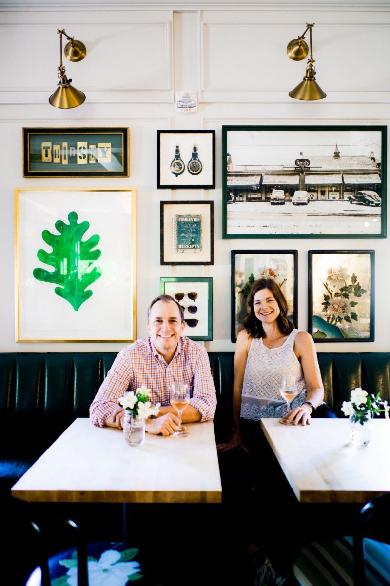
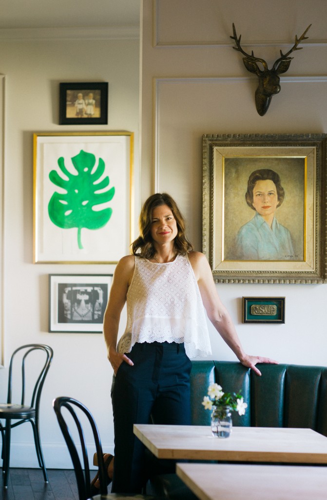
It’s our city’s original hometown specialty food store, known for its gourmet selections, neighborly service, and signature Southern style. When it was time for the Reid’s Fine Foods, with locations in both Myers Park and in South Park, to refresh its aesthetic, the team knew exactly who to reach out to. Barrie Benson, the renowned interior designer based in Charlotte, and John Lineweaver, a North Carolina native who founded Lineweaver Design & Communications of Atlanta, proved a design duo to be reckoned with.
John is known for ability to pair clean, simple branding and design with truly impactful results and Barrie’s work is defined by her expert use of color and energy, putting a modern spin on European and American 20th century pieces.
The result of their thoughtful planning and execution with Reid’s is a new face to a beloved institution, an homage to old-school with a brand-new twist. With the new store designs officially launched, Barrie and John sat down to answer questions on what it took to bring Reid’s into 2017.
How did you and John come to work together on this project?
Barrie: We had some friends in common and I heard a lot about John through a good friend. She kept saying, “just call him and talk to him.” When I did call him, we never stopped talking. Our first conversation lasted 4 hours, and that is when I realized he was perfect for the job. He is from the South, and he understands and calls out everything I’m thinking that I couldn’t put into words. It is such a Charlotte-based store, and Reid’s has so many nice experiences attached to it. It was fun to see John pull ideas from the owner, me and the city and put it into a design… We saw what we were missing the whole time.
I can sense elements of the design and what needs to be there and what it evokes, and then John finishes my sentence and zeros in on the intellectual part of it.
What was your collaboration process like?
John: We worked very closely. It really was a right-hand left-hand collaboration. We went back and forth so much together to eventually get to this cohesive whole. Most of my businesses focus on gourmet food or interior design or home furnishing. So this was completely in my wheelhouse and of course Barrie has a commercial background working with hospitality and hotels, as well as a burning passion for food and wine. We really both brought similar passions to the fold but we have different skillsets to fill in each other’s blanks. It rounded out to be a great cohesive unit.
How long did the project take?
Barrie: Southpark was very fast, it took from April to Thanksgiving.
What were the major goals behind the design?
John: A fresh take on the joys and comforts of the south. The multipurpose destination is a big part of it. You can pop in for a glass of wine, host a party of 40, or even just grab a cookie. Reid’s really created a personality and brand that carries on and is true. It creates internal mantras to live by to this day, which makes it easy to determine what is on and off-brand for Reid’s. We both felt the responsibility to take this beloved institution and bring it into a new era.
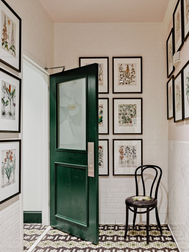
We wanted to celebrate the South and celebrate Queen City pride and the local allegiance people have for Reid’s. It was an institution born and raised in Charlotte. Reid’s new logo is based off the Reid’s neon sign and underlines the idea that we are a refreshed destination. It’s “modern” and “classic” in the same breath. We brought in classic greens – a pea green and the neon green – to tie everything together and give it a refresh for today. We kept the year Reid’s was established in the sign to give it prominence. These touches make Reed’s recognizable, and is a part of a greater visual vocabulary.
How did you call out the south specifically with the design?
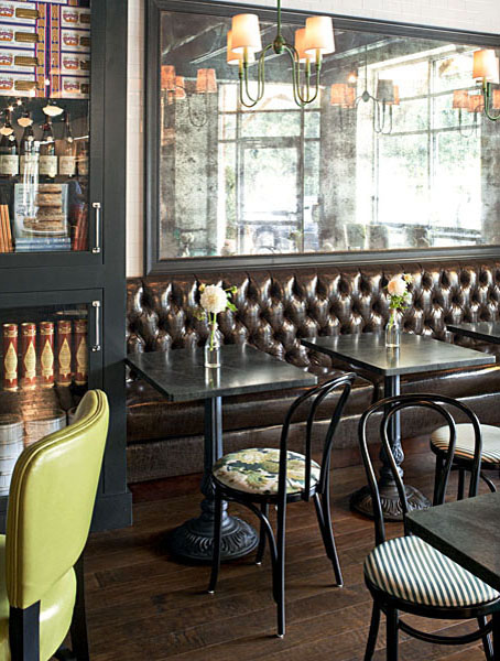
John: From an interior standpoint, there are definitely notes of the south whether it be the prints, wallpaper, or the color choices. We had big fun with the magnolia print on the barstools and chairs at the Southpark location. It’s just a great pop of happiness.
Barrie: We pushed the envelope on doing other things like a whole program of southern food so that whole theme runs throughout.
What did you two think was most important about Reid’s?
Barrie: We both travel and both are obsessed with food and we know when we go to cities, the most impressive places that you want to visit are the ones that give culture to the town. It was one of those things that it was so obvious what Reed’s needed to be to be this special place that everybody gathered.
John: It really has become a food community hub. It has a wine bar, food, and quick-store; it hits all those sweet spots and has become a multipurpose destination.
Barrie: If you’re from Charlotte, it is the perfect place to go pick up a bag of goodies and you feel like you’re bring a piece of Charlotte and the South with you. I can tell the butcher how many people I am having over and he can tell me exactly how much food I will need. Every part of the business – especially the service – exudes the south.
Did you use any local vendors?
Barrie: Yes. David Dooly to purchase the furniture. And the landscape architect was Morgan Landscaping. We wanted it to feel a little residental and that is their speciality. Everyone we used was local. All the equipment was bought from a local distributor in town.
What was the day-to-day like?
John: I was in Atlanta, so we were in contact virtually every day. Progress reports along the way helped a lot, and a lot of site visits happened. Barrie was in charge of the project from a leadership standpoint in terms of logistics and really the ground work. She kept everything in line along the way. She dealt with everybody from the sign company to the contractor. She really makes anything happen, and she knows Reid’s inside and out.


